Design Alphabet
Architectural magazine, Pin-Up, and their latest cover star, Travis Scott, have joined creative forces with renowned photographer, Thibaut Grevet and Creative Director Ben Ganz to create ‘The Alphabet of Design Principles’.
The rap sensation from Houston has always embraced and celebrated his creative side. He fearlessly delves into his artistic prowess, as is evident from his thought-provoking lecture on creativity at Harvard in 2018, as well as his collaborations with esteemed fashion labels like SUPRA and Alexander Wang. Throughout his career he has consistently delivered exceptional artistry, continuously evolving and refining his unique style. This is apparent not only in his captivating stage productions at his performances, but also by introducing a limited-edition action figure alongside his debut album.

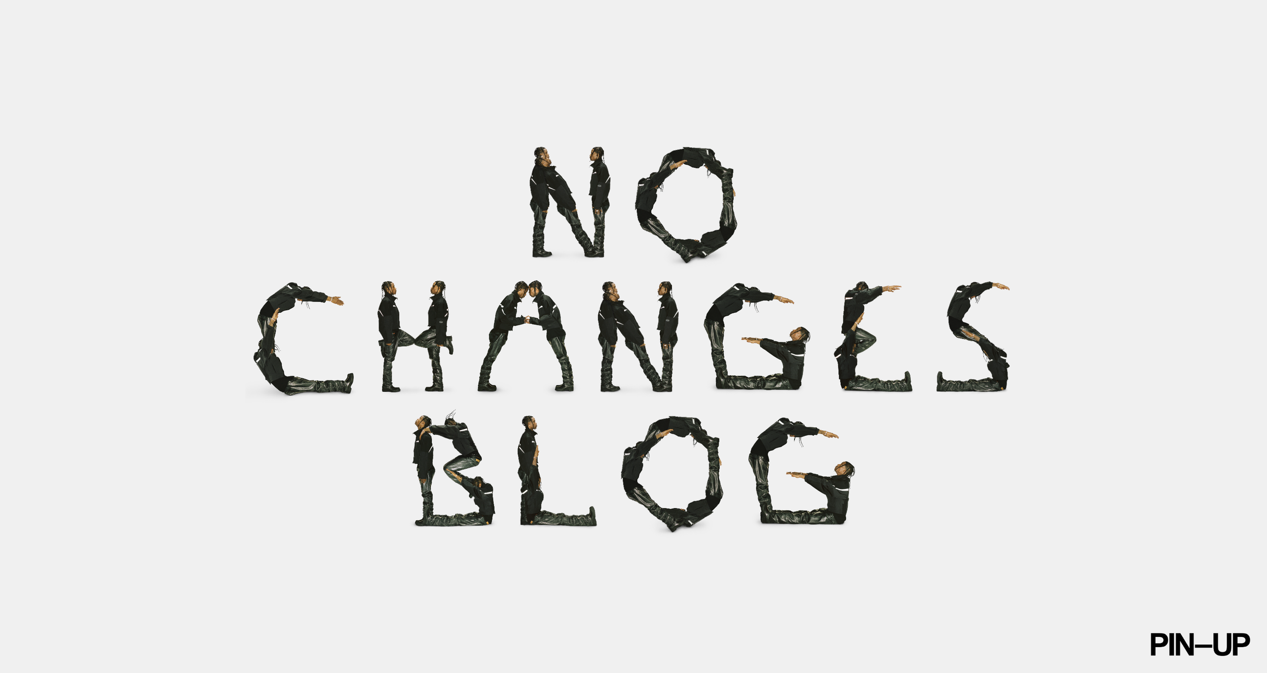
For this latest shoot, Thibaut has photographed Travis contorting to all 26 letters of the alphabet to accompany the article in which Travis goes through his A-Z of design principles. Covering subjects such as architecture, graphic design and sneakers. And what’s even better, they’ve created a literal Travis font which you can play about with your browser.

GRAPHIC DESIGN
It’s one of my true passions. A lot goes into graphic design. You usually gravitate to what matches how you feel or what represents your personality — colours, artwork, it all plays a part. Among my favourite American logos are Campbell’s Soup, Brillo, and Frenchy’s Chicken, which is a restaurant in Houston.TRAVIS SCOTT FOR PIN-UP MAGAZINE
The article and accompanying photoshoot in Pin-Up demonstrate the abundant room for creativity in magazine design and inviting music artists to fully embrace its possibilities.
Read the full article here.